
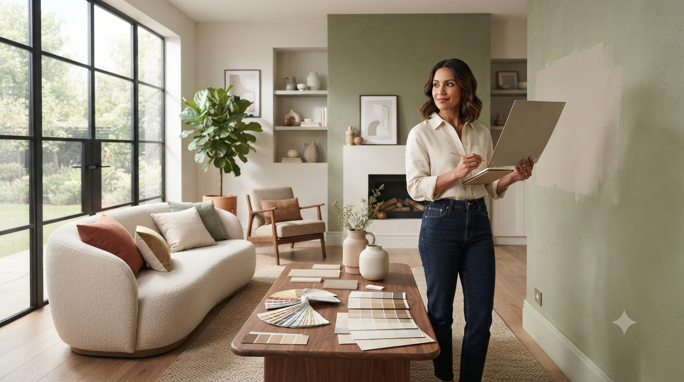
Choosing a paint color sounds simple—until you’re standing in front of hundreds of paint swatches wondering why every shade of white suddenly looks different. Many homeowners spend hours picking what seems like the perfect color, only to discover it looks too dark, too bright, or completely different once it’s on the wall.
If you’re wondering how to choose the right paint color for your home, you’re not alone. The right paint color can make a room feel larger, brighter, warmer, or more inviting. The wrong one can make even a beautifully designed space feel uncomfortable.
In this guide, you’ll learn how lighting affects paint colors, how to match colors with your home’s style and furniture, which mistakes to avoid, and a simple step-by-step method professionals use to select paint colors with confidence. Whether you’re painting one room or your entire home, these practical tips will help you make a choice you’ll love for years.
Why Choosing the Right Paint Color Matters
Choosing the right paint color improves your home’s appearance, influences mood, enhances natural light, complements furniture, and can even increase perceived property value. A well-chosen color creates harmony throughout the space, while the wrong color can make rooms feel smaller, darker, or visually unbalanced.
Paint isn’t just decoration—it’s one of the most powerful design tools in your home. It changes how large a room feels, how comfortable it is to spend time there, and how every other design element looks.
A carefully chosen color can:
- Make a small room feel spacious
- Add warmth to cold-looking interiors
- Brighten naturally dark spaces
- Highlight architectural details
- Create a relaxing atmosphere
- Improve your home’s overall visual appeal
Since repainting takes time and money, choosing wisely before you start can save both.
💡 Pro Tip: Never choose paint because it looked good in someone else’s house. Every home has different lighting, flooring, furniture, and room orientation.
What Should You Consider Before Choosing Paint Colors?
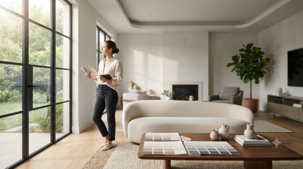
Before selecting a paint color, evaluate your room’s natural light, size, purpose, existing furniture, flooring, architectural style, and desired mood. These factors determine how a color will actually appear after it’s painted.
Professional interior designers rarely start by looking at paint samples.
Instead, they first study the room itself.
1. Room Purpose
Ask yourself one question:
How do I want this room to feel?
Different rooms benefit from different moods.
| Room | Best Feeling | Common Color Direction |
|---|---|---|
| Bedroom | Calm & Relaxing | Soft blues, warm grays, sage green |
| Living Room | Comfortable & Welcoming | Warm beige, greige, soft earth tones |
| Kitchen | Bright & Fresh | White, cream, light green, soft gray |
| Dining Room | Elegant & Cozy | Deep blue, olive green, warm neutrals |
| Bathroom | Clean & Airy | White, pale blue, light gray |
| Home Office | Focused & Balanced | Soft green, muted blue, warm gray |
Instead of asking,
“Which color is popular?”
Ask,
“Which color supports how I use this room?”
2. Natural Light Changes Everything
One of the biggest surprises for homeowners is that paint never looks exactly like it does in the store.
That’s because lighting constantly changes color.
North-Facing Rooms
These rooms receive cooler daylight.
Paint often appears:
- Slightly gray
- Cooler
- Less vibrant
Warm whites, creamy neutrals, and earthy colors usually balance the cool light.
South-Facing Rooms
South-facing rooms receive abundant warm sunlight.
Colors appear:
- Brighter
- Richer
- Warmer
Cooler grays and soft blues often work beautifully here.
East-Facing Rooms
Morning light is warm.
Afternoon light becomes cooler.
Soft neutral colors usually remain consistent throughout the day.
West-Facing Rooms
Morning light is muted.
Evening sunlight becomes warm and golden.
Warm colors may become much stronger during sunset.
⭐ Expert Tip: Always check paint samples in the morning, afternoon, evening, and at night before making your final decision.
3. Room Size Matters
Color influences how large a room appears.
Here’s a simple comparison.
| Goal | Best Color Choice |
|---|---|
| Make room feel larger | Light neutral colors |
| Make room feel cozy | Darker shades |
| Increase brightness | Warm whites |
| Add depth | Accent wall |
| Lower high ceilings visually | Slightly darker ceiling |
Lighter colors reflect more light.
Darker colors absorb it.
Neither is better—it simply depends on the effect you’re trying to create.
4. Existing Furniture Comes First
Many homeowners make this mistake:
They choose paint first.
Professionals usually do the opposite.
Furniture is expensive.
Paint is relatively easy to change.
Start by examining your:
- Sofa
- Cabinets
- Flooring
- Curtains
- Rugs
- Countertops
- Artwork
- Wood finishes
Your paint should support these permanent features—not compete with them.
For more ideas on creating balanced spaces, explore our Interior Design resources.
⚠ Common Mistake: Buying paint before choosing furniture often results in colors that clash once everything is in place.
Understanding Warm vs Cool Paint Colors
Warm paint colors contain yellow, red, or orange undertones and create cozy, inviting spaces. Cool colors contain blue, green, or violet undertones, making rooms feel calm, fresh, and spacious. Choosing the right undertone is often more important than choosing the color itself.
Many people think they’re choosing “gray.”
In reality, they’re choosing the undertone inside that gray.
That’s why two nearly identical paint samples can look completely different on your wall.
Warm Colors
Warm colors include:
- Cream
- Beige
- Warm white
- Terracotta
- Soft peach
- Warm taupe
- Earthy brown
Best for:
- Traditional homes
- Cozy living rooms
- Family spaces
- North-facing rooms
Cool Colors
Cool colors include:
- Blue-gray
- Sage green
- Crisp white
- Soft navy
- Lavender gray
Best for:
- Modern interiors
- Contemporary homes
- South-facing rooms
- Minimalist spaces
Quick Comparison
| Warm Colors | Cool Colors |
|---|---|
| Cozy | Calm |
| Inviting | Refreshing |
| Comfortable | Spacious |
| Traditional | Modern |
| Earth-inspired | Sky-inspired |
📌 Quick Tip: If your flooring has warm wood tones, warm paint colors usually blend more naturally than cool grays.
How to Identify Paint Undertones
Paint undertones are the subtle colors beneath the main shade. Comparing paint samples against pure white paper, checking them under different lighting conditions, and placing similar shades side by side helps reveal hidden undertones before painting.
This is where many paint projects go wrong.
A color labeled “white” may actually contain:
- Blue undertones
- Yellow undertones
- Pink undertones
- Gray undertones
- Green undertones
Those hidden tones become much more noticeable after painting an entire room.
Easy Test
Hold your paint sample beside:
- Bright white printer paper
- White ceiling paint
- Another similar paint sample
The undertones become much easier to notice.
Professional painters almost never evaluate a paint chip by itself.
Instead, they compare multiple similar shades together.
Step-by-Step: How to Choose the Right Paint Color for Your Home
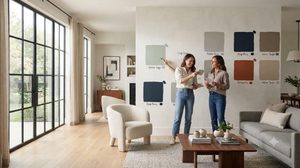
To choose the right paint color, start by identifying the room’s purpose, evaluate natural lighting, match existing furniture and flooring, narrow your color palette, test large paint samples on multiple walls, observe them throughout the day, and only then make your final selection.
Following a structured process helps you avoid expensive mistakes and ensures the final color feels right in your space.
Step 1: Define the Mood You Want
Before browsing paint colors, decide how you want the room to feel.
Ask yourself:
- Cozy?
- Bright?
- Elegant?
- Relaxing?
- Energetic?
- Modern?
Your answer will guide every color decision that follows.
Step 2: Analyze Your Lighting
Spend a full day observing the room.
Notice:
- Morning light
- Afternoon brightness
- Evening shadows
- Artificial lighting at night
Write down how the room changes over the day. This simple exercise helps you avoid choosing a color that only looks good at one specific time.
Step 3: Build Around Fixed Features
Start with elements that are difficult or expensive to replace:
- Flooring
- Kitchen cabinets
- Stone countertops
- Fireplace surrounds
- Built-in shelving
- Large furniture
Paint should connect these features into a cohesive design.
If you’re planning a full makeover, our Room Design guides can help you coordinate layouts, colors, and furniture more effectively.
Step 4: Create a Small Color Palette
Instead of choosing one paint color immediately, narrow your options to three to five similar shades.
For example:
- Warm White
- Soft Greige
- Light Beige
- Pale Taupe
- Cream
Comparing similar shades side by side makes subtle differences much easier to spot.
Step 5: Test Before You Buy
Never rely on a tiny paint chip.
Purchase sample pots and paint large sections (around 2 ft × 2 ft) on multiple walls.
Observe them:
- Morning
- Afternoon
- Evening
- Under lamps and ceiling lights
A color that looks perfect in daylight may appear too dark or too yellow after sunset.
⭐ Expert Tip: Paint sample boards that can be moved around the room are even better than painting directly on the wall. They let you compare colors against different backgrounds without committing to one location.
Choosing the Perfect Paint Color for Every Room
Now that you understand lighting, undertones, and how professionals narrow down paint choices, it’s time to apply those principles to each room in your home. Every space has a different purpose, so the “best” paint color depends on how the room is used—not just what’s trending.
How to Choose Paint Colors for Each Room
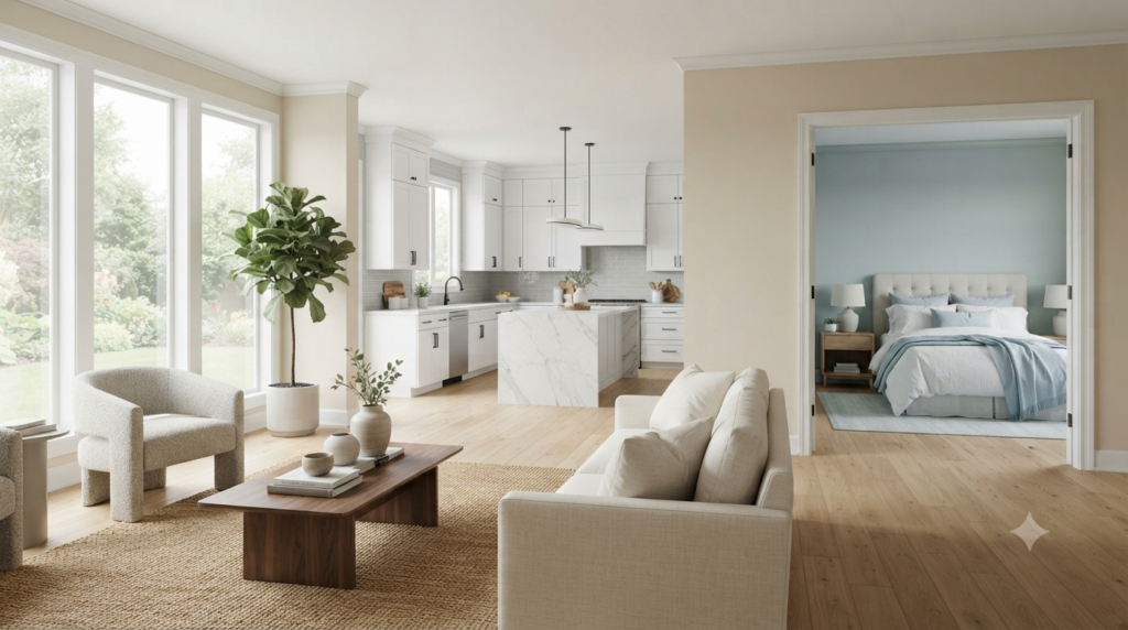
The best paint color for each room depends on its function, lighting, furniture, and the atmosphere you want to create. Bedrooms typically benefit from calming colors, kitchens from bright neutrals, and living rooms from warm, welcoming tones that connect the home’s overall design.
Rather than painting every room a different bold color, think of your home as one connected space. Colors should flow naturally from one room to the next.
Living Room
The living room is often the most-used space in the house. It should feel inviting, comfortable, and flexible enough for both relaxing and entertaining.
Best Paint Colors
- Warm white
- Greige
- Soft beige
- Light taupe
- Sage green
- Warm gray
These colors work well because they pair with most furniture styles and don’t quickly go out of fashion.
If Your Living Room Is Small
Choose:
- Light cream
- Soft white
- Pale gray
- Light greige
These shades reflect more light and create the illusion of extra space.
If Your Living Room Is Large
You have more flexibility.
Consider:
- Olive green
- Charcoal accent wall
- Navy blue
- Deep earthy tones
Dark colors can make a large room feel warmer and more intimate.
💡 Pro Tip: Instead of painting every wall dark, use one accent wall behind the fireplace or television to create depth without overwhelming the room.
Bedroom
Your bedroom should help you relax after a busy day.
Avoid colors that feel overly bright or stimulating.
Great Bedroom Colors
- Soft blue
- Sage green
- Dusty lavender
- Warm gray
- Muted beige
- Soft white
These colors create a peaceful environment and work well with natural fabrics like linen and cotton.
Colors to Use Carefully
Very bright:
- Red
- Orange
- Neon yellow
These energetic colors may not support restful sleep when used on every wall.
Kitchen
Modern kitchens often look best with bright, clean colors that make the room feel fresh.
Popular choices include:
- White
- Cream
- Soft gray
- Warm greige
- Pale green
If you have white cabinets, adding a soft colored wall can introduce personality without making the space feel busy.
For more kitchen inspiration, visit our Home Improvement Tips section, where you’ll find renovation and remodeling ideas.
Bathroom
Bathrooms usually have limited natural light, making color selection especially important.
Good choices include:
- Crisp white
- Pale gray
- Light blue
- Soft aqua
- Light sage
These shades create a clean, spa-like atmosphere while helping smaller bathrooms feel more open.
📌 Quick Tip: If your bathroom has no windows, test paint under the same artificial lighting you’ll use every day.
Dining Room
Dining rooms offer more freedom to experiment.
Popular choices include:
- Deep green
- Navy blue
- Warm terracotta
- Rich beige
- Chocolate brown accents
These colors create a cozy setting for family meals and entertaining guests.
Home Office
A productive workspace should feel calm without being boring.
Many professionals recommend:
- Soft green
- Muted blue
- Warm gray
- Neutral white
These shades reduce visual distractions while creating a balanced environment for work or study.
Should Every Room Be the Same Color?
No. Every room doesn’t need the same paint color, but the colors should complement each other. A consistent palette with similar undertones creates visual flow while allowing each room to have its own personality.
Many homeowners believe every room should be identical.
Others make every room a completely different color.
The best approach is somewhere in the middle.
Example Whole-Home Palette
| Room | Color Family |
|---|---|
| Living Room | Warm Greige |
| Hallway | Soft White |
| Kitchen | Cream |
| Bedroom | Sage Green |
| Bathroom | Pale Gray |
| Office | Warm Gray |
Although each room has its own color, they all belong to a similar palette, creating a cohesive look throughout the home.
How to Create a Whole-Home Color Palette
Professional designers rarely choose colors one room at a time. Instead, they build a palette that works across the entire house.
A simple formula is:
- 60% Main Color – Dominates the home.
- 30% Secondary Color – Adds contrast and interest.
- 10% Accent Color – Used in décor, furniture, artwork, or feature walls.
Example
Main Color:
- Warm White
Secondary Color:
- Greige
Accent Color:
- Olive Green
This approach keeps your home looking coordinated without feeling repetitive.
Understanding Paint Finishes
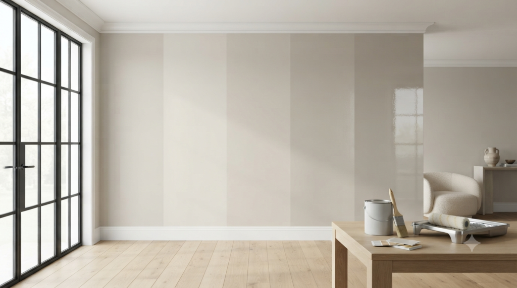
Paint finish affects durability, appearance, and maintenance. Matte hides imperfections, eggshell offers a subtle sheen, satin is easy to clean, semi-gloss resists moisture, and gloss provides maximum durability but highlights wall flaws.
Choosing the right finish is just as important as choosing the right color.
Matte Finish
Best for:
- Bedrooms
- Ceilings
- Adult living spaces
Pros
✔ Hides wall imperfections
✔ Elegant appearance
✔ Soft finish
Cons
✘ Harder to clean
Eggshell Finish
Best for:
- Living rooms
- Dining rooms
- Hallways
Pros
- Slight sheen
- Easy maintenance
- Popular for most interiors
Satin Finish
Best for:
- Kitchens
- Children’s rooms
- Busy hallways
Pros
- Durable
- Washable
- Moisture resistant
Semi-Gloss Finish
Best for:
- Trim
- Doors
- Bathrooms
- Cabinets
It reflects more light and is very easy to clean.
Gloss Finish
Usually reserved for:
- Furniture
- Decorative trim
- Cabinets
Because it’s highly reflective, it also highlights dents and wall imperfections.
Quick Comparison Table
| Finish | Best For | Durability | Easy to Clean |
|---|---|---|---|
| Matte | Bedrooms | Medium | Low |
| Eggshell | Living Rooms | Medium | Good |
| Satin | Kitchens | High | Very Good |
| Semi-Gloss | Bathrooms & Trim | Very High | Excellent |
| Gloss | Cabinets | Highest | Excellent |
Timeless Paint Colors vs. Trendy Paint Colors
Many people wonder whether they should follow current color trends.
The answer depends on your long-term plans.
| Timeless Colors | Trendy Colors |
|---|---|
| Warm White | Dark Forest Green |
| Greige | Bold Black |
| Beige | Deep Plum |
| Light Gray | Mustard Yellow |
| Sage Green | Terracotta Accent Walls |
Timeless colors usually have better resale appeal and remain stylish for years.
Trendy colors can look stunning but may feel outdated sooner.
⭐ Expert Tip: If you love bold colors, use them in accent walls, artwork, cushions, or décor instead of painting the entire room.
How to Test Paint Before Making the Final Decision
Always test paint samples on multiple walls and observe them at different times of day. Lighting, shadows, flooring, and surrounding furniture can dramatically change how a paint color appears once it’s applied.
Never skip this step.
Professional painters almost always test before committing.
Follow This Checklist
✅ Buy sample pots.
✅ Paint at least two large sections.
✅ Test multiple walls.
✅ Check morning light.
✅ Check afternoon light.
✅ Check evening light.
✅ Turn lamps on.
✅ Compare with furniture.
✅ Live with the samples for two or three days.
This process takes a little extra time but can save you from repainting an entire room.
Paint Color Combinations That Always Work
If you’re unsure where to start, these combinations are safe, timeless, and versatile.
| Main Color | Accent Color | Works Best In |
|---|---|---|
| Warm White | Sage Green | Living Room |
| Greige | Navy Blue | Office |
| Cream | Olive Green | Kitchen |
| Soft Gray | White Trim | Modern Homes |
| Beige | Charcoal | Contemporary Interiors |
| White | Natural Wood | Scandinavian Style |
These pairings create balance without overwhelming the space.
For ideas on styling these palettes with décor and accessories, browse our Home Decor collection.
Expert Designer Secrets for Choosing Paint Colors
Professional designers don’t rely on luck—they follow proven habits that reduce costly mistakes.
1. Choose Flooring First
Flooring is expensive and difficult to replace.
Paint is much easier to change.
Always coordinate your paint with the floor rather than the other way around.
2. Don’t Trust Tiny Paint Chips
A color on a small swatch can look completely different across an entire wall.
Large sample boards provide a much more accurate impression.
3. Keep the Ceiling Slightly Lighter
A lighter ceiling helps rooms feel taller and brighter.
This subtle contrast creates a more open appearance without drawing attention to itself.
4. Limit Bold Colors
Use bold shades strategically.
Accent walls, built-in shelves, or decorative niches allow you to introduce personality while keeping the room balanced.
5. Think About Adjacent Rooms
Stand in one room and look into the next.
Ask yourself:
- Do the colors flow naturally?
- Do they share similar undertones?
- Does one room feel disconnected?
Professional-looking homes maintain visual continuity even when each room has a unique identity.
Common Mistakes to Avoid When Choosing Paint Colors
The most common paint color mistakes include choosing colors under store lighting, skipping paint samples, ignoring undertones, following trends without considering your home’s style, and selecting the wrong paint finish. Testing colors at home and planning a cohesive palette helps avoid expensive repainting.
Even experienced homeowners make mistakes when choosing paint. The good news is that most of them are easy to avoid once you know what to look for.
1. Choosing Paint Under Store Lighting
Paint stores use bright artificial lighting that doesn’t match the lighting in your home.
A color that looks perfect in the store may appear:
- Darker in your living room
- Cooler in a north-facing bedroom
- Warmer in a sunny kitchen
How to avoid it:
- Take home sample cards.
- Buy sample pots.
- Test them on your own walls.
2. Ignoring Paint Undertones
Many people compare only the main color and forget about undertones.
For example:
- Two white paints may look identical until one appears yellow and the other blue after painting.
How to avoid it:
Compare similar shades side by side against a sheet of pure white paper.
⚠ Common Mistake: Choosing a “gray” paint without checking whether it has blue, green, or purple undertones often leads to disappointing results.
3. Buying Paint Before Choosing Furniture
Paint is one of the easiest design elements to change.
Furniture, flooring, and countertops are not.
Choose your permanent features first, then select paint that complements them.
4. Using Too Many Bold Colors
Every room doesn’t need a dramatic feature wall.
Too many bold colors can make your home feel visually busy and disconnected.
Instead:
- Use neutral walls.
- Add personality through artwork, cushions, rugs, curtains, and accessories.
5. Skipping Paint Samples
This is probably the biggest mistake homeowners make.
A tiny paint chip cannot accurately represent how a color will look on an entire wall.
Always test large samples before making your final decision.
6. Forgetting About Artificial Lighting
Paint changes after sunset.
Warm LED bulbs make colors appear warmer.
Cool daylight bulbs make colors appear crisper.
Test your paint both during the day and at night.
7. Following Trends Instead of Your Lifestyle
Social media trends change every year.
Your home should reflect your personal taste, daily routine, and long-term needs.
Choose colors you’ll still enjoy several years from now.
Paint Color Selection Checklist
Before buying your final paint, ask yourself these questions:
✅ Does the room receive warm or cool natural light?
✅ Have I tested the color on multiple walls?
✅ Have I checked the paint in the morning and evening?
✅ Does it match my flooring?
✅ Does it complement my furniture?
✅ Is the finish suitable for this room?
✅ Does it connect well with nearby rooms?
✅ Will I still like this color in five years?
If you answered “Yes” to all of these, you’re ready to move forward with confidence.
Quick Decision Guide
| If You Want… | Choose… |
|---|---|
| A larger-looking room | Light neutral colors |
| A cozy atmosphere | Warm earth tones |
| A modern interior | Soft grays and crisp whites |
| A timeless design | Warm white, greige, beige, sage green |
| Easy decorating | Neutral walls with colorful décor |
| Better resale appeal | Classic neutral paint colors |
Expert Recommendations
After years of interior design projects, professionals consistently follow a few simple rules that help them achieve better results.
⭐ Expert Tip: Start with your flooring, cabinets, and large furniture before looking at paint colors. These fixed elements have a much bigger influence on the overall design.
Professional designers also recommend:
- Test paint for at least 48 hours before deciding.
- Compare colors under natural and artificial lighting.
- Keep a consistent color palette throughout your home.
- Use bold colors sparingly on accent walls or décor.
- Invest in high-quality paint for better durability and coverage.
- Choose finishes based on the room’s function, not appearance alone.
If you’re updating more than just your walls, you may also find inspiration in our Furniture and Exterior Design guides.
Key Takeaways
- Choosing the right paint color starts with understanding the room—not the paint swatches.
- Natural and artificial lighting can dramatically change how colors appear.
- Always consider flooring, furniture, cabinets, and décor before selecting paint.
- Warm and cool undertones are often more important than the color name itself.
- Test large paint samples on multiple walls and observe them throughout the day.
- Select the appropriate paint finish for each room to improve durability and maintenance.
- Create a whole-home color palette so every room feels connected.
- Timeless neutral colors generally offer greater flexibility and long-term appeal.
- Accent colors are an excellent way to add personality without overwhelming a space.
- Careful planning today can save you time, money, and frustration later.
Your Paint Color Questions, Answered
What is the best paint color for the entire house?
Neutral shades such as warm white, greige, soft beige, and light gray are among the best whole-house paint colors. They create a consistent flow between rooms, work with most furniture styles, and remain attractive for many years. A neutral foundation also makes seasonal decorating much easier.
Should walls be lighter or darker than furniture?
In most homes, walls are slightly lighter than large furniture pieces. This creates contrast, prevents rooms from feeling heavy, and allows sofas, cabinets, and décor to stand out naturally. However, darker walls can also work beautifully when balanced with lighter furnishings and good lighting.
How do I know if my paint has warm or cool undertones?
Compare the paint sample with bright white paper or another similar shade. Warm undertones often appear yellow, cream, or beige, while cool undertones lean toward blue, green, or violet. Viewing samples under both natural and artificial light makes undertones much easier to identify.
Should every room in my house be painted the same color?
Not necessarily. Each room can have its own personality, but the colors should belong to a coordinated palette. Using similar undertones throughout your home creates a natural transition from one space to another without making every room look identical.
Is white paint always the safest choice?
White is versatile, but not every white works in every home. Some whites have warm undertones, while others appear cool or stark. The best white depends on your lighting, flooring, and furniture. Testing several white samples is always worth the extra effort.