
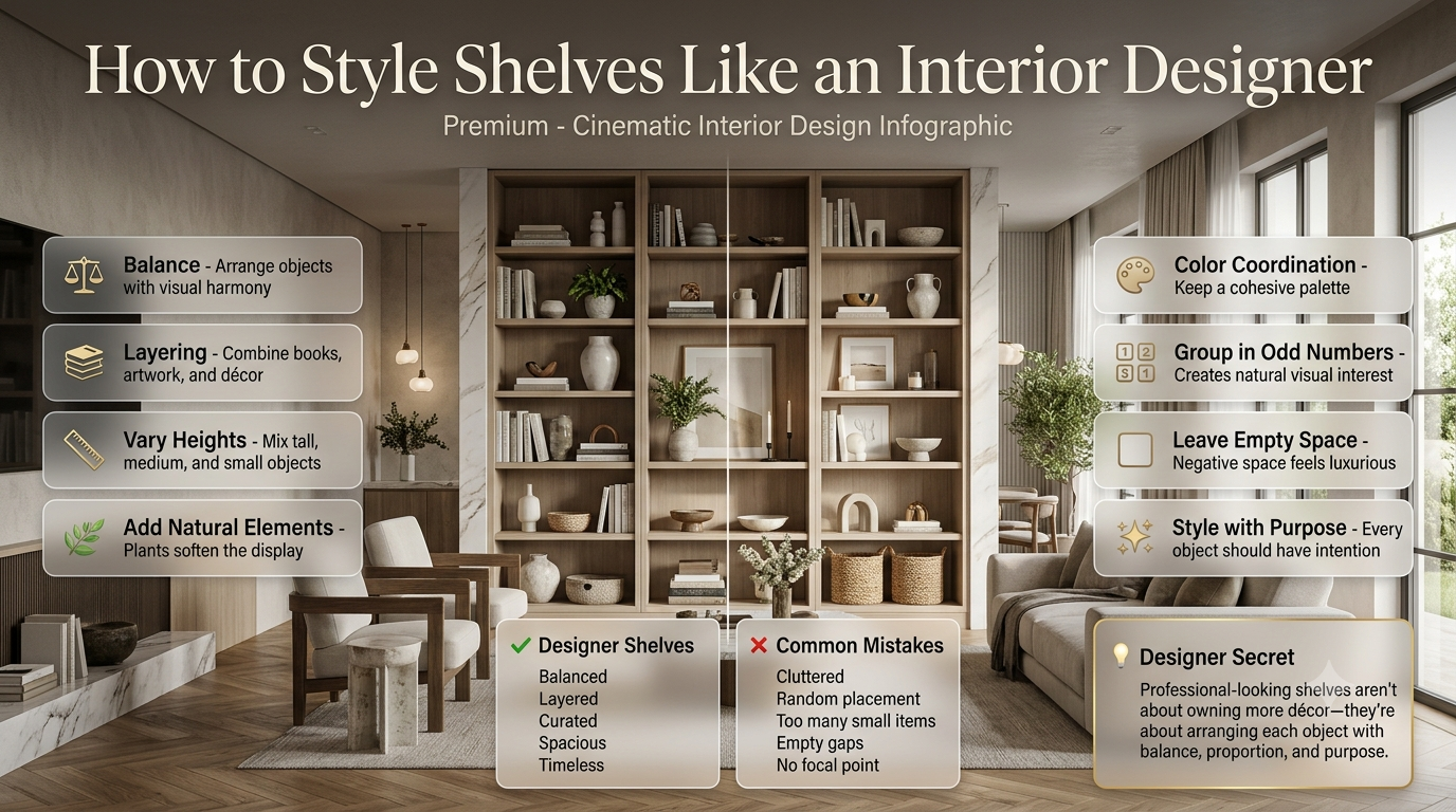
Walk into a professionally designed home, and you’ll notice that the shelves never look random. Every book, vase, plant, and decorative object seems to have a purpose, creating a space that feels elegant without appearing overdecorated.
Many homeowners struggle to achieve the same effect. Their shelves often become cluttered with souvenirs, mismatched decorations, or empty spaces that make the room feel unfinished. Buying more decorative pieces rarely solves the problem. The difference isn’t how much designers spend—it’s how they arrange what they already have.
If you’ve ever wondered how to style shelves like an interior designer, you’re in the right place. In this guide, you’ll learn the professional principles behind beautiful shelf styling, practical design formulas, common mistakes to avoid, and easy techniques that work in living rooms, bedrooms, kitchens, home offices, and built-in shelving.
Whether you’re decorating floating shelves, bookshelves, or custom built-ins, these expert ideas will help you create shelves that look intentional, balanced, and timeless.
Featured Snippet: How Do Interior Designers Style Shelves?
Interior designers style shelves by combining books, decorative objects, plants, artwork, baskets, and personal accessories in balanced groups. They vary heights, colors, and textures, leave intentional empty space, and create visual balance instead of filling every shelf. The goal is a curated display that feels collected rather than crowded.
How to Create Perfect Visual Balance
Visual balance in shelf styling means distributing color, size, weight, and decorative objects evenly across the shelves. Interior designers avoid placing all large or dark items on one side, creating displays that feel naturally balanced without being perfectly symmetrical.
One of the biggest secrets behind professionally styled shelves is visual balance. This doesn’t mean every shelf has to look identical. Instead, it means the overall arrangement feels comfortable to the eye.
Imagine one side of a bookshelf filled with large black storage boxes while the other side only has a small candle. Even if both sides occupy the same amount of space, the shelving will feel uneven because the visual weight isn’t balanced.
Interior designers constantly step back and view the entire shelving unit instead of focusing on one shelf at a time.
Balance Visual Weight
Every object has visual weight.
Generally:
| Item | Visual Weight |
|---|---|
| Large basket | Heavy |
| Dark-colored vase | Heavy |
| Large stack of books | Heavy |
| Small white candle | Light |
| Glass vase | Light |
| Small plant | Medium |
A heavy object on one side should usually be balanced by another substantial item elsewhere.
For example:
Top Shelf:
Large plant                    Small books

Middle Shelf:
Books                    White vase + candle

Bottom Shelf:
Basket                    Sculpture
The shelves don’t match exactly, but they feel balanced as a whole.
⚠ Common Mistake: Many beginners place all decorative items on the top shelves while using the bottom shelves only for storage. This creates a top-heavy appearance that makes the room feel visually unbalanced.
Use Color Like an Interior Designer
Professional shelf styling uses a consistent color palette throughout the display. Instead of introducing many unrelated colors, designers repeat a few complementary shades to create harmony and visual flow.
Color has a huge impact on shelf styling.
Beautiful shelves rarely contain every color imaginable.
Instead, designers repeat a limited palette across the display.
For example, if your living room already includes:
- Beige
- White
- Black
- Natural wood
Those same colors should appear throughout your shelving.
Repeating colors helps connect the shelves to the rest of the room.
Follow the 60-30-10 Rule
A popular decorating guideline is:
| Percentage | Purpose |
|---|---|
| 60% | Primary color |
| 30% | Secondary color |
| 10% | Accent color |
Example:
- White shelves
- Oak wood décor
- Black picture frames
- Olive green plants
The result feels coordinated instead of random.
Bright accent colors work best when used sparingly. One blue vase or one brass sculpture can become a focal point without overwhelming the shelf.
If you’re refreshing an entire room, browse our Room Design ideas for inspiration that complements your shelf styling.
💡 Pro Tip: Repeat the same accent color at least three times across different shelves. This creates rhythm and makes the entire display feel intentional.
Mix Different Textures for a Richer Look
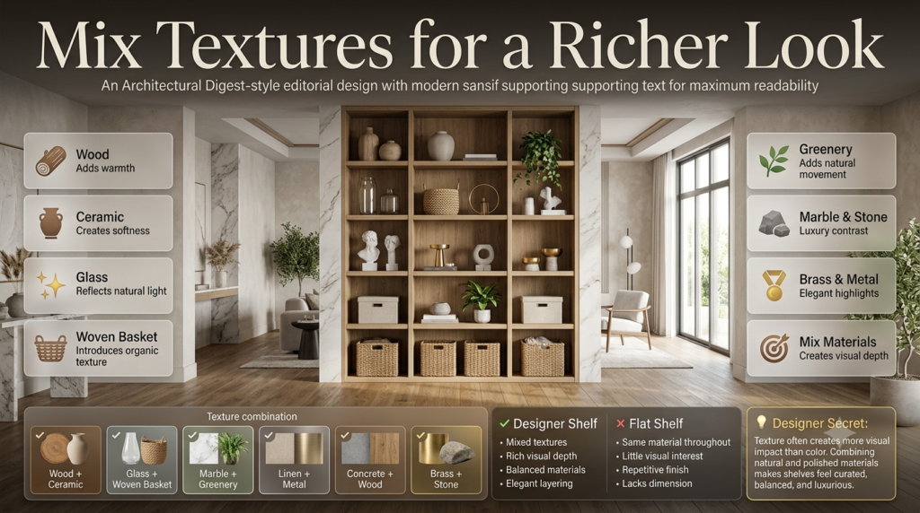
Interior designers mix smooth, rough, soft, shiny, and natural materials to create depth. Combining wood, glass, ceramics, woven baskets, metal, and greenery prevents shelves from looking flat or repetitive.
Texture often matters more than color.
Imagine a shelf filled entirely with glossy white ceramic vases.
Even though the colors match, the display may feel boring because every object has the same finish.
Instead, combine different materials.
Great texture combinations include:
- Wood + ceramic
- Glass + woven baskets
- Marble + greenery
- Linen boxes + metal accents
- Concrete + wood
- Brass + stone
Each material reflects light differently, adding visual interest.
Example Texture Combination
| Material | Purpose |
|---|---|
| Wood | Warmth |
| Ceramic | Softness |
| Glass | Light reflection |
| Woven basket | Natural texture |
| Plant | Organic movement |
| Metal | Contrast |
Even simple shelves become more inviting when multiple textures work together.
⭐ Expert Tip: If your shelves feel dull, don’t immediately buy more decorations. Instead, replace one or two items with a different material to add contrast.
Vary Heights to Create Movement
One common mistake is arranging every object at the same height.
Flat lines make shelves look stiff.
Professional designers intentionally vary heights to guide the eye naturally across the display.
Instead of this:
Vase Vase VaseCreate something like:
Tall Vase

Books

Small Plant

Medium Sculpture
Notice how the eye moves smoothly between different heights.
Ways to vary height include:
- Stacking books
- Using taller branches
- Leaning artwork
- Mixing tall and short vases
- Elevating objects on trays
Movement makes shelves feel alive.
Leave Empty Space
Professional shelf styling always includes empty space. Negative space allows decorative objects to stand out, prevents visual clutter, and gives the shelves a clean, sophisticated appearance.
One of the hardest lessons for many homeowners is learning when to stop decorating.
Not every inch needs to be filled.
Interior designers intentionally leave sections empty because empty space helps the eye rest.
Benefits include:
- Highlights important pieces
- Makes shelves appear larger
- Reduces visual clutter
- Creates a luxury feel
- Improves balance
Think of empty space as part of the design—not wasted space.
Luxury homes almost always feature generous negative space.
📌 Quick Tip: After styling your shelves, remove one decorative item from each shelf. In many cases, the shelves will immediately look cleaner and more expensive.
How to Style Different Types of Shelves
Different shelves require different styling techniques.
Let’s look at the most common types.
Styling Floating Shelves
Floating shelves look best with lightweight décor, layered artwork, books, small plants, and carefully spaced accessories. Avoid overcrowding because floating shelves rely on simplicity for their modern appearance.
Floating shelves are usually more visible than built-ins.
Keep arrangements light and airy.
Ideal décor includes:
- Framed artwork
- Small plants
- Decorative bowls
- Books
- Candles
- Ceramic vases
Avoid filling every inch.
Floating shelves look best when approximately 30–40% of the surface remains visible.
Styling Built-In Bookshelves
Built-in shelves provide more flexibility.
Professional designers usually combine:
- Books
- Closed storage
- Decorative accessories
- Artwork
- Plants
- Sculptures
The goal is to avoid making every shelf identical.
Instead, alternate between:
Books → Décor → Storage → Books → Artwork
This creates rhythm across the entire wall.
If you’re updating custom shelving as part of a renovation, explore our Home Improvement Tips section for more practical ideas.
Styling Open Kitchen Shelves
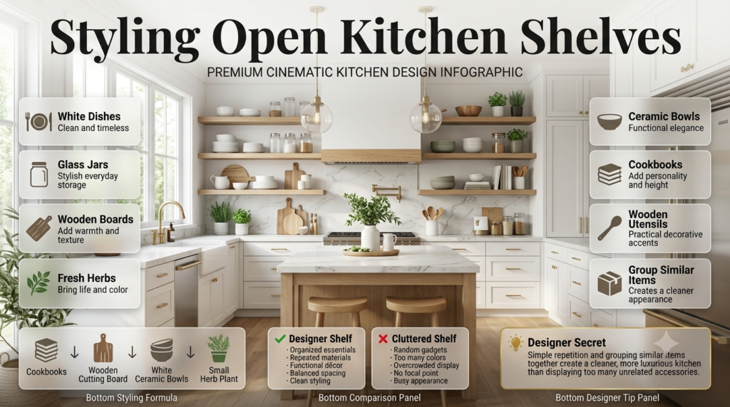
Kitchen shelves should be both beautiful and functional.
Good decorative choices include:
- White dishes
- Glass jars
- Wooden cutting boards
- Small herbs
- Ceramic bowls
- Cookbooks
- Wooden utensils
Avoid displaying too many unrelated kitchen gadgets.
Keeping similar items together creates a cleaner appearance.
Example:
Cookbooks
↓

Wooden board
↓

White bowls
↓

Small herb plant
Simple repetition often looks better than excessive variety.
Styling Living Room Bookshelves
Living room shelves usually become the focal point of the room.
A balanced formula includes:
- 40% books
- 30% decorative objects
- 15% greenery
- 15% personal accessories
Mix vertical books with horizontal stacks.
Place artwork behind decorative objects to create depth.
Add baskets near the bottom for hidden storage.
This combination provides beauty without sacrificing function.
Styling Bedroom Shelves
Bedrooms benefit from calm, relaxing décor.
Choose soft colors and meaningful accessories such as:
- Framed photographs
- Linen storage boxes
- Candles
- Small plants
- Books
- Ceramic vases
Avoid bright colors or overly busy displays.
Keeping shelves simple supports a peaceful atmosphere.
Styling Home Office Shelves
Office shelves should balance professionalism with personality.
A designer-approved combination includes:
- Books
- Awards
- Storage boxes
- Small plants
- Framed certificates
- Minimal artwork
- Sculptural décor
Keep everyday office supplies hidden whenever possible.
Visible clutter can make the workspace feel stressful and reduce productivity.
Shelf styling is about much more than displaying decorations.
Properly styled shelves influence how an entire room feels. They can make a small room appear larger, add warmth to modern interiors, introduce personality, and tie together different furniture pieces into one cohesive design.
Poorly styled shelves have the opposite effect. Even expensive furniture can look messy when shelves are overcrowded or filled with unrelated objects.
Professional designers often treat shelving as part of the room’s architecture rather than simple storage. Instead of asking, “What can I put here?” they ask, “How does this shelf contribute to the room?”
That small shift in thinking changes everything.
If you’re updating an entire room, our Interior Design resources can help you create a more cohesive look throughout your home.
Think Like an Interior Designer Before You Start
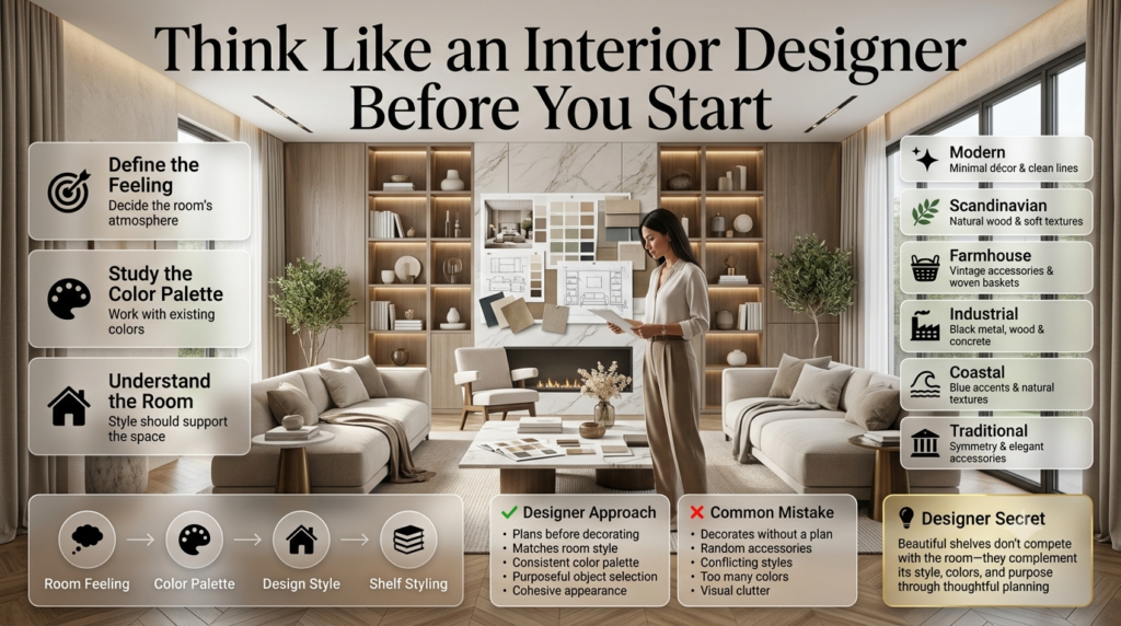
Before placing a single decorative item, interior designers decide on the room’s style, color palette, and purpose. Every shelf should support the overall design instead of competing with it.
One of the biggest reasons professionally styled shelves look effortless is because designers begin with a plan.
They rarely start decorating immediately.
Instead, they first identify three things:
- What feeling should the room create?
- Which colors already dominate the space?
- What style is the room following?
For example:
| Room Style | Shelf Styling Approach |
|---|---|
| Modern | Minimal objects, clean lines, neutral colors |
| Scandinavian | Natural wood, soft textures, light colors |
| Farmhouse | Vintage accessories, woven baskets, greenery |
| Industrial | Black metal, wood accents, concrete décor |
| Coastal | Blue accents, natural textures, glass décor |
| Traditional | Symmetrical layouts and elegant accessories |
Matching shelf décor with the room’s existing style creates harmony instead of visual confusion.
Start With a Blank Shelf
One of the simplest professional techniques is also the most overlooked.
Remove everything.
Designers almost always begin with completely empty shelves.
Starting fresh allows you to:
- See the available space clearly
- Remove unnecessary clutter
- Keep only meaningful items
- Create intentional arrangements
- Avoid decorating around old mistakes
Although it may feel like extra work, clearing the shelves often makes the styling process much faster.
💡 Pro Tip: Take a photo of your empty shelves before decorating. It helps you evaluate your final design more objectively and compare different arrangements.
The Golden Rule: Decorate in Layers
Professional shelf styling follows a layering technique where larger items are placed first, medium-sized objects add depth, and smaller accessories complete the arrangement. This creates a natural, collected look instead of a flat display.
Layering is one of the biggest differences between amateur decorating and designer styling.
Instead of lining objects up in a single row, designers build depth by placing items at different distances and heights.
A typical shelf often follows this order:
Layer 1: Background
Large artwork
Framed prints
Mirrors
Decorative panels
Large trays
These pieces establish the backdrop without taking over the display.
Layer 2: Medium Objects
This layer includes:
- Decorative vases
- Ceramic bowls
- Sculptures
- Storage boxes
- Candle holders
They become the primary focal points.
Layer 3: Foreground Details
Finally, smaller items complete the arrangement:
- Small plants
- Coral pieces
- Decorative beads
- Small candles
- Personal keepsakes
These finishing touches add personality without overwhelming the shelf.
Simple Layering Example
Back:
Large framed artwork

Middle:
White ceramic vase
Stack of books

Front:
Small candle
Mini plant
Decorative bead garland
Notice how nothing sits perfectly in one line.
Instead, every item overlaps slightly to create depth.
⭐ Expert Tip: If every decorative object is the same depth, your shelves will appear flat. Place some items slightly forward and others farther back to create natural dimension.
Essential Items Every Beautiful Shelf Should Include
Many people assume they need dozens of expensive decorations.
Interior designers usually work with surprisingly few categories of décor.
The secret is choosing a balanced mix.
Here are the most common elements you’ll find on professionally styled shelves.
1. Books
Books are the foundation of great shelf styling.
They introduce:
- Color
- Height
- Texture
- Personality
Designers often stack books both vertically and horizontally to create platforms for decorative objects.
Coffee table books work especially well because of their attractive covers and larger size.
2. Greenery
Plants instantly make shelves feel alive.
Some excellent options include:
- Pothos
- Snake plants
- ZZ plants
- Succulents
- Eucalyptus stems
- Faux olive branches
Even one small plant softens hard shelving lines.
If you’re decorating multiple rooms, you’ll also find helpful ideas in our Home Decor collection.
3. Decorative Objects
These create personality.
Popular designer choices include:
- Ceramic vases
- Sculptures
- Wooden beads
- Marble décor
- Decorative bowls
- Glass pieces
- Handmade pottery
Rather than filling every shelf with similar accessories, vary the shapes and materials for a more dynamic display.
4. Artwork
Leaning framed artwork instead of hanging every picture creates a relaxed, designer-inspired look.
Small prints layered behind decorative objects add visual interest without requiring extra wall space.
Artwork also helps break up rows of books and accessories.
5. Baskets and Boxes
Not everything should remain visible.
Beautiful woven baskets and decorative storage boxes hide everyday items while adding texture.
They’re especially useful for:
- Remote controls
- Chargers
- Office supplies
- Toys
- Cables
- Small household essentials
This combination of beauty and function is something designers prioritize in nearly every project.
6. Personal Items
Professional-looking shelves don’t have to feel impersonal.
Meaningful objects make a home unique.
Consider displaying:
- Travel souvenirs
- Family photographs
- Handmade pottery
- Vintage finds
- Antique books
- Awards
- Meaningful heirlooms
The key is selecting only your favorites instead of displaying everything at once.
📌 Quick Tip: A shelf that mixes books, greenery, artwork, decorative objects, and one or two personal items almost always looks more interesting than a shelf filled with only one type of décor.
The Rule of Three: Why Designers Group Objects
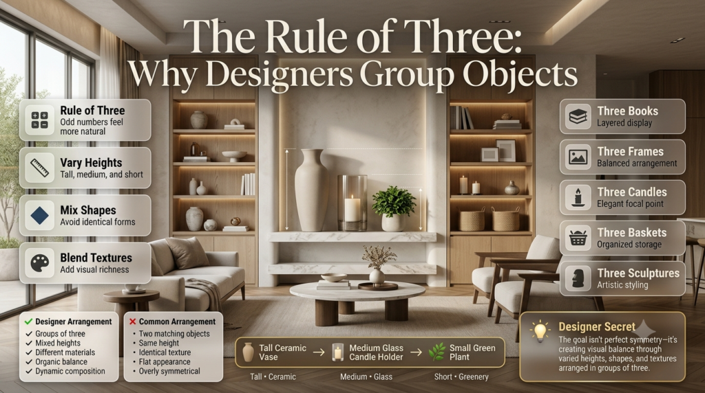
Interior designers often group decorative items in sets of three because odd-numbered arrangements look more natural and visually balanced than even-numbered groupings. Varying the height, shape, and texture of each item creates additional interest.
One of the oldest interior design principles is the Rule of Three.
Instead of placing two matching decorations side by side, designers often create groups of three items with different heights and shapes.
For example:
| Item | Height | Material |
|---|---|---|
| Tall ceramic vase | Tall | Ceramic |
| Candle holder | Medium | Glass |
| Small plant | Short | Greenery |
Each object complements the others without looking identical.
This simple formula prevents shelves from appearing too symmetrical or staged.
The same idea works with:
- Three books
- Three framed photos
- Three candles
- Three sculptures
- Three baskets
The goal isn’t perfection—it’s balance through variation.
The Designer Shelf Styling Formula That Always Works
A simple designer shelf styling formula is Books + Greenery + Decorative Object + Artwork + Personal Item + Empty Space. Repeat this combination across your shelves while varying height, texture, and color to create a balanced, professional-looking display.
If you’ve ever looked at beautifully styled shelves and wondered how designers make everything look so effortless, it’s because they often follow a repeatable formula rather than decorating randomly.
Here’s an easy approach that works in almost every home.
| Element | Purpose |
|---|---|
| Books | Add structure and height |
| Artwork | Creates depth |
| Decorative Object | Adds personality |
| Plant | Introduces life and color |
| Basket or Box | Provides hidden storage |
| Personal Item | Makes the space unique |
| Empty Space | Prevents clutter |
Think of this as a recipe rather than a strict rule. You don’t need every element on every shelf, but including most of them across the entire shelving unit creates a balanced, collected look.
⭐ Expert Tip: After arranging everything, step back 6–8 feet and look at the shelves as a whole. Designers rarely judge shelf styling from only a few inches away.
Shelf Styling Ideas for Popular Interior Design Styles
Your shelves should reflect the style of your home. A beautifully styled shelf can still feel out of place if it doesn’t match the surrounding décor.
Modern
Modern shelves focus on simplicity.
Use:
- Black and white décor
- Clean-lined vases
- Glass accents
- Minimal accessories
- Abstract artwork
- Sculptural pieces
Less is almost always more.
Scandinavian
Scandinavian interiors emphasize warmth and simplicity.
Choose:
- Light wood
- White ceramics
- Neutral books
- Linen storage boxes
- Soft greenery
- Handmade pottery
The result should feel cozy without becoming cluttered.
Farmhouse
Farmhouse shelves mix rustic charm with practical storage.
Include:
- Vintage books
- Woven baskets
- Wooden frames
- Ceramic pitchers
- Cotton stems
- Antique accessories
Natural textures work especially well in this style.
Industrial
Industrial shelf styling features bold materials and darker tones.
Popular choices include:
- Black metal
- Reclaimed wood
- Concrete planters
- Vintage clocks
- Leather storage boxes
- Wire baskets
Keep accessories simple and functional.
Coastal
Coastal shelves should feel light and airy.
Use:
- White ceramics
- Driftwood
- Glass bottles
- Coral-inspired décor
- Blue accents
- Natural rope textures
Avoid overly themed beach decorations. A few subtle references create a more sophisticated look.
Traditional
Traditional interiors often feature symmetrical arrangements.
Decorate with:
- Elegant book collections
- Brass candle holders
- Framed artwork
- Porcelain vases
- Classic sculptures
- Rich wood finishes
Balance and refinement are the priorities.
If you’re decorating an entire space, you’ll find more inspiration in our Home Decor and Furniture guides.
Common Shelf Styling Mistakes to Avoid
Even expensive décor won’t create a designer look if these common mistakes are present.
1. Filling Every Empty Space
Overcrowded shelves quickly become visual clutter.
Instead, leave breathing room around your favorite pieces.
2. Buying Décor Before Creating a Plan
Many homeowners purchase decorations simply because they look attractive in a store.
Professional designers first determine:
- Style
- Color palette
- Shelf purpose
- Overall room design
Then they shop with intention.
3. Using Everything at Once
Not every keepsake needs to be displayed.
Rotate seasonal or sentimental items throughout the year to keep your shelves feeling fresh.
4. Ignoring Scale
Tiny decorations can disappear on large bookshelves.
Likewise, oversized accessories may overwhelm smaller floating shelves.
Always choose décor that fits the size of the shelving unit.
5. Everything Matches Perfectly
Matching furniture sets were once popular.
Today’s designer homes focus on coordination instead of perfect matching.
Mix different:
- Materials
- Shapes
- Heights
- Finishes
- Textures
The result feels much more natural.
6. Forgetting Function
Shelves should still be useful.
Decorative storage baskets can hide everyday essentials while maintaining a clean appearance.
⚠ Common Mistake: Styling shelves only for social media photos often leads to impractical displays. Your shelves should work for everyday life, not just look good in pictures.
Professional Designer Secrets
Experienced interior designers rely on small details that many homeowners overlook.
Here are a few of their favorite tricks.
Lean Artwork Instead of Hanging Everything
Layering framed artwork behind books or vases instantly adds depth.
Stack Books Horizontally
Horizontal stacks create platforms for candles, sculptures, or plants.
Repeat Shapes
Repeating curved vases, round bowls, or rectangular frames creates rhythm throughout the shelves.
Use Natural Greenery
Plants soften hard shelving lines and introduce movement.
Even realistic faux plants can achieve a similar effect in low-light areas.
Include One Statement Piece
Every shelving unit benefits from one object that immediately draws attention.
Examples include:
- Large ceramic vase
- Oversized sculpture
- Unique artwork
- Antique clock
- Handmade pottery
Let this become the focal point.
Edit Regularly
Professional designers rarely leave shelves untouched for years.
They periodically remove, rearrange, or replace accessories to keep the display feeling fresh.
💡 Pro Tip: Take a photo of your shelves in black and white. Without color, it’s much easier to notice problems with balance, height, and visual weight.
Quick Shelf Styling Checklist
Before you finish decorating, ask yourself:
✔ Have I mixed different heights?
✔ Are books arranged both vertically and horizontally?
✔ Have I added greenery?
✔ Is there enough empty space?
✔ Do colors match the room?
✔ Have I mixed textures?
✔ Are personal items included?
✔ Is one focal point clearly visible?
✔ Are heavier objects visually balanced?
✔ Does the display feel collected rather than crowded?
If you answered “yes” to most of these, you’re well on your way to achieving a designer-quality result.
What is the 60-30-10 rule for shelf styling?
The Expert Breakdown:
The 60-30-10 rule is a foolproof design formula used to balance color and visual texture across your shelving unit. It dictates that 60% of your shelf space should feature a dominant element or color (usually books or matching earthenware), 30% should consist of a secondary supporting element (like metallic accents, wood tones, or contrasting book spines), and 10% is reserved for your accent piece (a pop of vibrant color, a unique sculptural object, or a statement piece of art). This distribution ensures the eye moves naturally across the display without feeling overwhelmed by competing colors or cluttered textures.
Dominant (60%): Grouped hardback books, uniform storage baskets, or large matching ceramic vases.
Secondary (30%): Picture frames, trailing plants, and contrasting materials like matte black metal or warm wood.
Accent (10%): A single brass object, a bright piece of coral, or a bold abstract painting.
How do you mix books and decor without making shelves look cluttered?
The Expert Breakdown:
The secret to avoiding a cluttered look is varying the orientation of your books and incorporating intentional negative space. Instead of lining books up vertically from left to right like a library, group them into small, distinct clusters. Alternate between stacking books horizontally to act as a pedestal for small objects, and standing them vertically next to a heavy bookend. Designers use a “zigzag” pattern, placing a vertical book stack on the top left shelf, a horizontal stack on the middle right shelf, and so on. This guides the viewer’s eye in a pleasant, rhythmic flow across the entire unit.
Vary Orientation: Switch between horizontal stacks and vertical rows on alternating shelves.
Use Books as Pedestals: Place small sculptures, candles, or air plants on top of horizontal book stacks.
Edit Ruthlessly: Leave roughly one-third of every shelf completely empty to give the items room to “breathe.”
How do I choose a cohesive color palette for my shelf display?
The Expert Breakdown:
A professional shelf display relies on a curated color palette that complements the existing room rather than fighting it. To achieve this, select two neutral base colors and one accent color that ties into your rugs, curtains, or pillows. If you have mismatched, brightly colored book spines that disrupt your palette, turn the books backward so the neutral pages face out, or wrap them in uniform kraft paper. Mix your metals (like brass or iron) with organic tones (like stoneware, linen, or terracotta) to introduce depth without introducing chaotic, clashing colors.
The Neutral Base: Use creams, grays, or wood tones for the largest items to establish a clean backdrop.
The Backward Book Trick: Flip colorful novels around to expose the cream/tan pages for an instant minimalist aesthetic.
Material Harmony: Treat textures—like shiny brass, matte ceramics, and rough stone—as part of your color palette.
What are the best decor items to buy for high-end shelf styling?
The Expert Breakdown:
High-end shelf styling relies on a mix of scales, shapes, and materials to look expensive and intentionally collected over time. Avoid buying massive sets of identical decor from big-box retailers. Instead, curate a collection of objects with varying heights and organic silhouettes. Every well-styled shelf needs structural anchors (like heavy stone bookends), organic elements (like preserved green moss balls or trailing ivy), and items that add vertical height (such as lean, framed artwork or tall candlesticks). Mixing vintage, thrifted finds with modern pieces instantly elevates the entire room.
Structural Anchors: Marble bookends, oversized ceramic jugs, or heavy wooden bowls.
Organic Life: Potted plants, dried eucalyptus, driftwood, or geometric crystals.
Height Generators: Framed sketches leaning against the back wall, or tall taper candle holders.
How do you style deep shelves or deep bookcases effectively?
The Expert Breakdown:
Deep shelving can easily look like a dark, cavernous void if you do not utilize the layering technique. To style deep shelves like a designer, create a foreground, a middle ground, and a background. Start by leaning large, flat items like framed art, mirrors, or wide decorative trays directly against the back wall to pull the back of the shelf forward. Next, place your medium-sized items, like book stacks, in the middle. Finally, layer small, delicate objects or trailing plants in the very front, allowing them to slightly overlap the pieces behind them to create rich, dimensional depth.
Background Layer: Large framed photos or flat platters to anchor the depth and catch light.
Middle Ground Layer: Substantial items like books, boxes, or medium vases that fill the core space.
Foreground Layer: Tiny trinkets, small bowls, or low-hanging greenery that spill slightly forward.
Conclusion
Learning how to style shelves like an interior designer isn’t about purchasing expensive décor or copying perfectly staged photos. It’s about understanding the principles that professionals use every day—balance, layering, texture, proportion, color, and intentional simplicity.
Start with a blank shelf, build your display gradually, and focus on creating a mix of books, greenery, artwork, decorative objects, and meaningful personal pieces. Don’t be afraid to leave empty space, experiment with different arrangements, or edit your display over time. The most beautiful shelves evolve naturally rather than being completed in a single afternoon.
As you continue improving your home, explore our Interior Design, Room Design, DIY Crafts, Exterior Design, Outdoor & Garden, Landscaping, and the Home Page for more expert home improvement ideas and inspiration.
With a little planning and these designer-approved techniques, your shelves can become one of the most eye-catching and personal features in your home.